Personal Case Studies | Game design | Halo’s UI
Summary
Games live and die by their details: sound, story, UI, and atmosphere. Halo showed how those details can define an entire franchise. Here’s a look at how its design changed over time, and why it matters.
“So new. So unfinished.”
How Halo’s UI and Atmosphere Shifted Over Two Eras
From Bungie
to 343:


Main Menus
The player’s first interaction


Immersion
Bungie’s menus made this agency immersive. Navigating felt like interacting with ancient terminals or classified files, reinforcing the immersion.

Feedback
Even the smallest menu actions, selecting Campaign, scrolling through settings, were backed by feedback, pacing, and visuals that built anticipation.

Story
The menus also took great lengths to tell a story. Typically with a sweeping view of the Halo ring, a war torn city, or a barren wasteland with ancient technology. These vignettes gave the player a sense of what to expect.

Grandiose
Simplicity
A quiet story
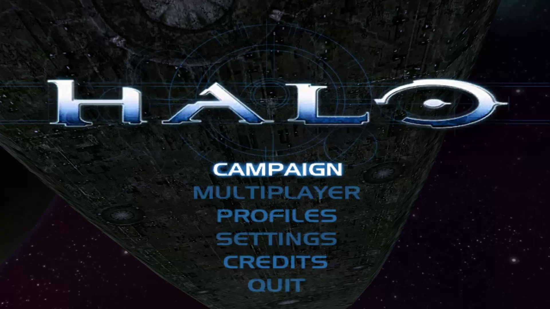
Halo is a thrilling space opera FPS that tells the story of humanity battling a superior alien force. Drawing inspiration from sources like cassette futurism, Gundam, and even Christianity, it creates a rich narrative. You don’t need to play for hours to grasp the story; in just the first three minutes and 51 seconds of Halo: CE's main menu, you get the essence of the plot set on a mysterious ring world. The music also adds depth to the experience. This unique storytelling style is present throughout the Bungie era, enhancing your appreciation for the crafted narrative.
“They call it, Halo”
Halo’s menus use striking images. For example, the first entry shows a vast ring world, with a gas giant behind it. The story unfolds on this ancient ring world, captured in one MOV file. The UI is simple, clean, and stylized, guiding players effectively.
“So this is what my father found...”
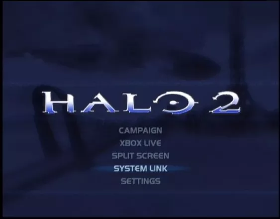
Halo 2’s main menu remixes the past. New Mombassa, humanity’s last stronghold, is under attack by a massive Covenant supercarrier, 5.4 km long. In 2004, this set the stage for an iconic story. The UI was simple and clear, guiding players to each title with a new blue overlay, enhancing the in-game feel.
“Your poet Elliot had it wrong...”
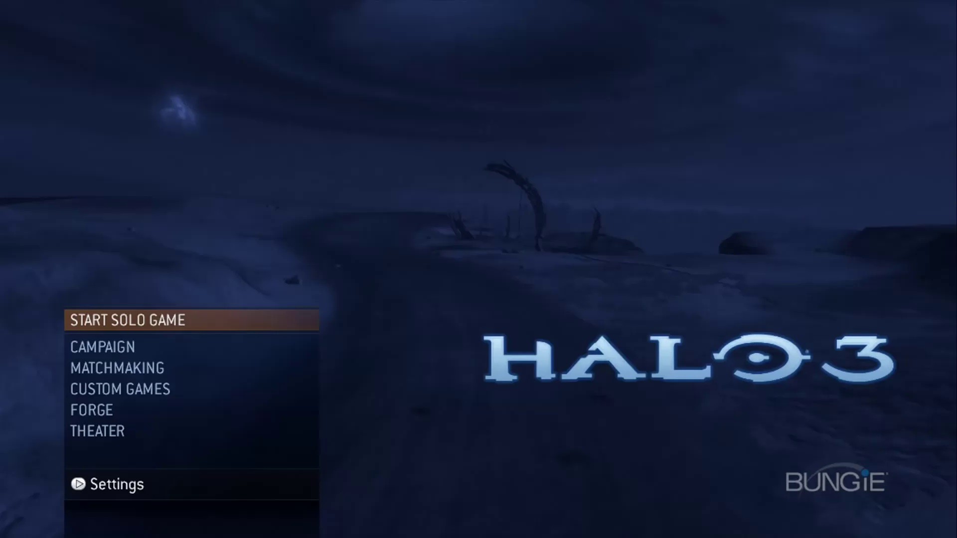
The anticipation for Halo 3's release on September 27, 2007, was immense. Its UI design featured a blue-toned main menu with Covenant carriers excavating the earth, enhancing the mystery of Halo. The evolved UI included subdued fonts and a vertical layout, creating an atmosphere reminiscent of Forerunner terminals, leaning into the diegetic nature of the main menu.
Function
over form
Growing up doesn’t always mean getting better
Bungie’s last Halo game was 2010’s Halo: Reach, a prequel to Halo: CE. It wrapped up the story nicely, echoing George Lucas’ words, “it’s like poetry, it rhymes.” Two years later, 343 Studios, made of Halo fans, was tasked with remastering Halo: CE. While updating the graphics seemed promising, it received mostly negative feedback for losing the original's charm. The remaster felt more like a push for excitement rather than a faithful recreation. 343 didn’t need a massive identity change to generate interest.
“Wake up, John...”
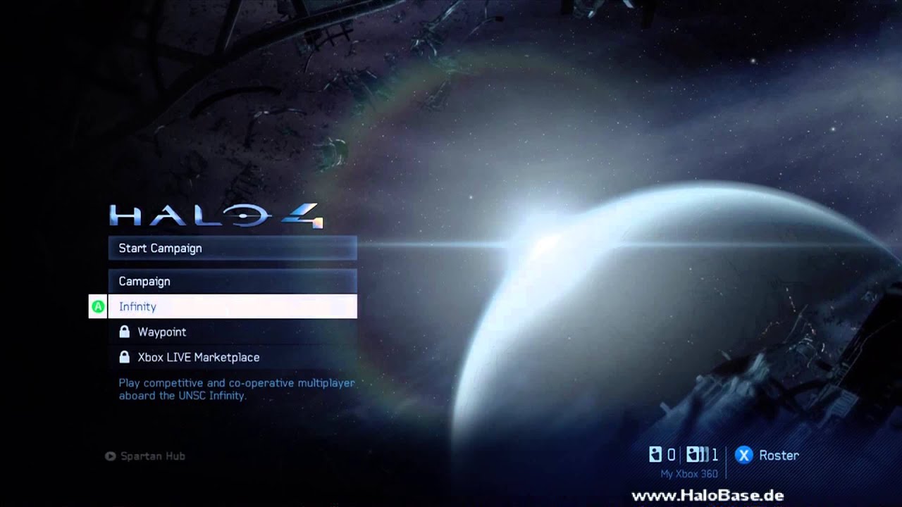
Halo 4 had great aspects: a compelling villain, a new setting, and a deep narrative. The main menu was engaging, with a planet eclipsing a sun and captivating music. However, something felt off. The blue tint was colder, the vista static, and the music lacked cohesion. Small elements detracted from Halo’s identity. The UI felt hand-holdy, with button prompts by menu titles and dashboard tiles replacing full display menus. Hovering over “start campaign” read “experience the return of the Master Chief,” but it felt like a distorted echo.
“Time was your ally...”
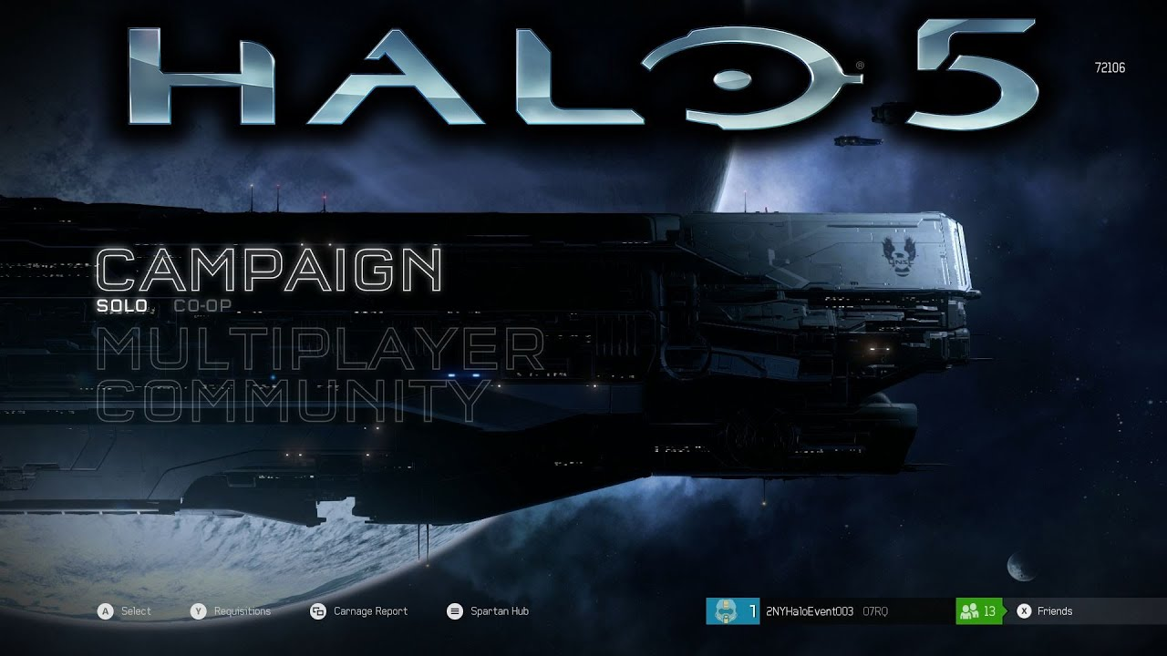
Halo 5 felt like a departure from previous games. While Halo 4 wasn’t perfect, Halo 5 reacted to its negative feedback. The UI and atmosphere were lacking; the main menu didn’t tell a story. Just a few Human ships on screen with disjointed elements and a large outline font. Halo 5 felt clunky from the start, giving a poor first impression. It aimed to be different, but many factors affected its connection to the past.
“The mission changed, always does.”
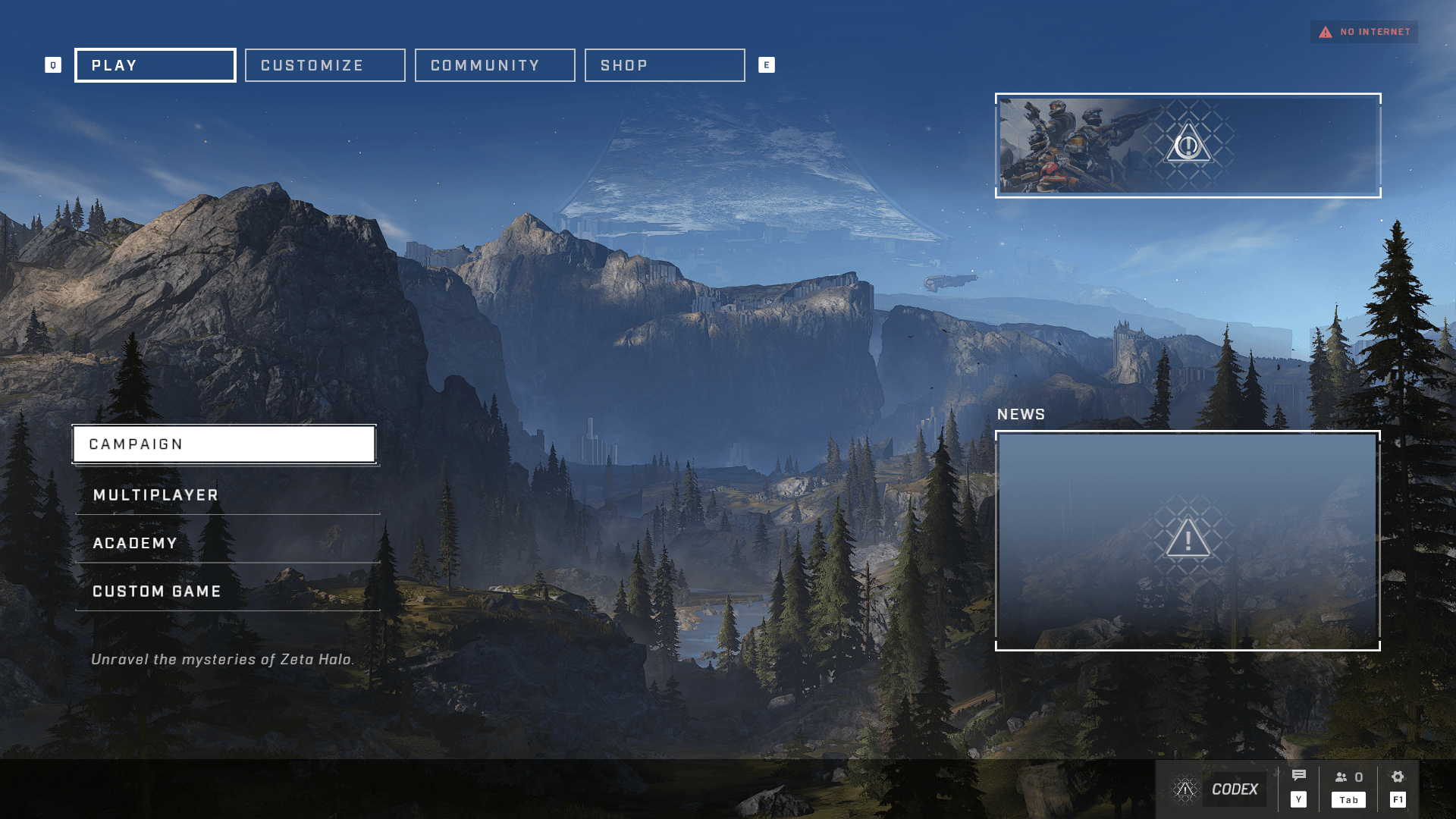
Halo Infinite is an interesting case, reacting to Halo 5’s poor reception. It returned to familiar art styles but became a semi-open world game. Despite its strengths, it felt too late. This was 343’s last entry before restructuring. While it got much right, it followed trends instead of forging its own path.

Verdict
Form vs Function
Menus aren’t just buttons, they’re the first story a game tells. They can be immersive, functional, or both. What matters is intention.
Halo’s history shows the danger of chasing trends or shifting too fast: players feel the whiplash.
The takeaway? Don’t treat menus as an afterthought. Use them to set tone, build identity, and make choices that last.
View more:

eDreams
Homepage revamp

eDreams
Trust integration

Game design
Halo: CE’s music